Quantitative Software Quality Management — Part II
Measurements to estimate the results of your quality practices
This is the 2nd part of 2-part series of posts showing practical ways to manage QA quantitatively, using statistics. In this 2nd part, I’ll focus on estimating the quality of releases, features, and the resources needed to manage releases post-production. The 1st part was about monitoring the effectiveness of QA activities.
Make sure to check the Part I of this series, where I talk about measurements to monitor the effectiveness of quality practices.

SEM Blog | Quantitative Software Quality Management — Part I
Measurement and Analysis
Software Measurement is extremely important and heavily misused. People tend to choose measures thinking about the value the measures can bring. However, this is misleading.
In the book “Controlling Software Projects,” Tom DeMarco said, “you can’t control what you can’t measure.” And that’s correct. However, he never said you need to control everything.
Measurement is expensive, and you should only measure things that you have to. It involves a lot of software engineering knowledge, process knowledge, and statistics.
This is a 2-part post series, where I’ll share with you the most interesting QA-related measures I’ve used. The first post will focus on monitoring the performance of QA activities/processes and improvement initiatives. The second will focus on estimation.
Capacity (Effort) Estimation
Of course, knowing the effort your organization (or team) employs to resolve a defect will be the base measure you need.
Let’s say you have one defect that took 10 hours to be resolved. You will plot your first bar with value 10 and height 1 (one defect). If you have 5 defects that took about 50 hours to be resolved, you will plot the second bar with a height of value 50 and a height of 5 (five defects). This is the process of building a histogram, like the one below. The expectation is that there will be a higher number of defects around the center. If you find two or more clear peaks, be assured that unknown factors influence the process of fixing these defects, and you should identify them and break them into different groups.
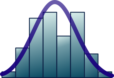
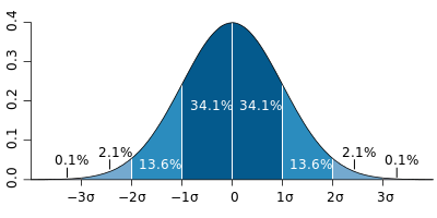
The center of the chart will point towards the average time. Many people fall into the mistake of taking the average to stipulate the effort. However, in a normal distribution, half of your incidents will fall below the average (that’s when you fix with the estimated effort or less), and half will fall beyond the average (requiring more effort). The following chart shows the percentage of defects that will take between the average effort and ± 1, 2, and 3 standard deviations.
If you pick the average, it means that at each sprint or release cycle, you will be able to resolve the defects that require less than the average effort and just a few defects above the average. There will be some defects that you won’t be able to resolve that will accumulate in your backlog.
To avoid accumulating defects, you have to choose an effort that accounts for a higher number of defects. An excellent way to calculate it is to sum the values in your histogram. This is called the “cumulative function.” You can calculate it by looking at each bar in your histogram and adding that bar’s count (frequency) to all bars to the left of that one. You will have a chart that looks like this (a Sigmoid function):
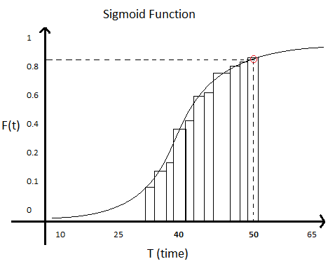
On the x-axis (bottom), you have the longest time that group of defects took. On the y-axis (left), you have the number of defects that can be resolved with that amount of time or less. For each bar, divide the number of incidents by the total number of incidents and multiply by 100 to get a percentage.
If you look at this chart, there is a point signaled in red. For the sake of this example, that point tells you that if you pick around 50 hours to resolve one defect, you will be able to resolve a little over 80% (maybe 85%) of them with this effort or less, leaving the remaining time for other activities or more complex defects. These more complex defects are expected to be 15% of the total number. It’s a good odd. It’s similar to guessing the number you will get rolling a 6-face dice.
Note that a VERY similar approach can be used to estimate effort require to support your SLA/SLO:

SEM Blog | Customer Support for Software Engineers — Part II
Now that you know that, you need to calculate the effort per release or sprint, which means you will need to be able to estimate how many defects you are expected to get from the changes you are introducing, which is the objective of the next two sections!
Defect Density

If your team didn’t release changes, it didn’t create defects. If your team only made cosmetic changes (fixed typos or visual components appearance), there will be no defects (or very few either). If the changes were significant, sometimes changing part of the software architecture, they might be considered risky due to the probability of defects’ high number (or high impact).
The number of defects alone is a base measure. A simple count. Unfortunately, it can be very misleading. To allow a fair comparison between different releases, we must divide this measure by a base measure of size (e.g., story points, use case points, lines of code, function points, or any size measure). In doing so, we create a derivate measure: # of defects/size. This is the defect density.
An example would be 0.1 defects/story point, which means that a story with 8 story points could have between 0 and 1 defects (0.8 ~ most likely 1).
Other examples commonly used on requirements reviews or inspections would be 0.02 defect/sentence or 0.70 defect/page.
The advantage of using measures like Story Points, use Case Points, Function Points, or SNAP is that you can use it to estimate how many defects you expect to find in a story or epic, a use case, or a defined set of requirements. It helps guide your reviews, inspections, and testing efforts.
However, because these measures don’t necessarily correlate to the size of the changes to existing code, often “lines of code” (or, more precisely, KLOC — thousands of lines of code) is still used. This is especially easy to adopt nowadays with code formatter integrated to build pipelines and pre-commit formatter hooks that allow for code format standardization.
“Count Lines of Code or CLOC” is a great tool to count the lines of code. It gives you results separate by language/file type, different changes between GIT hashes, removes blank lines and comments, ignores specific files, and writes results to a database, among many other valuable features.
Defect prediction

I think this is possibly one of the most exciting pieces of this post. It’s one of the most valuable practices in QA Management and maybe the least popular, predicting how many defects a set of changes might have.
If you are planning a release with some features and changes and you know how many defects you can expect from them, you can:
- allocate the necessary resources and people for post-production support
- opt for phased rollouts (with different groups of clients at a time)
- postpone the release of certain features to the next release
- split big features into parts to be rolled out across other releases
- adopt extra QA activities (like running beta tests)
- implement feature flags to allow disabling certain features or even fallback to previous behavior
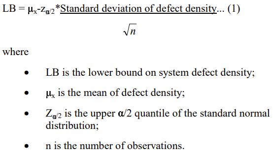
In “Use of Relative Code Churn Measures to Predict System Defect Density,” a case study from North Carolina State University and Microsoft Research reports using the formula below to determine if a software is prone to defects. They were able to do it with 89% of confidence. Don’t be intimidated by it; I’ll explain something more accessible, step-by-step, and way more interesting.
How about estimating how many defects a specific release may have depending on how many changes.
The chart below is a Control Chart. I built it from the same data I used for the identified x escaped defects, plus the number of lines changed per release.
The Defect Density here is calculated as the number of defects on each release divided by the number of KLOC (thousands of lines of code) that were changed (added + removed + modified) in each release.
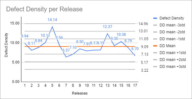
Each gray line shows the mean defect density plus or minus 1, 2, or 3 standard deviations from the mean. If you look closely, most points fall between the mean +/- 2 standard deviations. This is about what we expect.
If you remember this chart, you will notice that 95.4% of the observations will fall in that range if the variation is entirely random.
In this case, unfortunately, there is an observation skewing our analysis. I know this because I have built a boxplot, the easiest way to do it. That point alone high up there is an “outlier.” It tells us that that observation is too far from the others, which means it must have an attributable cause to that value. We need to find what that cause is and change our process so it doesn’t happen again (if it were a good observation, we would want to change the process to make sure it keeps happening).
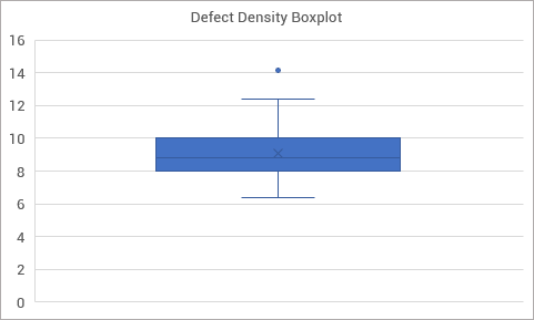
Once we remove it, we need to check if there aren’t any new others. There aren’t, in this case.
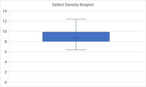
We proceed with our analysis without that single observation (14.14 defects/KLOC). If 95.4% certainty is good enough for you, the expected number of defects will be between the mean — 2 standard deviations and the mean + 2 standard deviations. If you want a different level of certainty, you can proceed with the same analysis we did with the cumulative function. For 99.8%, you can work with +/- 3 standard deviations from the mean (but that will probably be too high and give you a variation range too high to be helpful).
If you are curious about more sophisticated ways to identify attributable causes in your process (many of which won’t be detected in a boxplot), check the Nelson Rules.
Now, if you calculate the individual defect densities of each feature or changeset in your release you can use it as the mean and apply the same standard deviation to determine, with the same level of confidence, the number of defects it might have. This will allow you to have an insight into how each changeset will influence the estimated number of defects in your upcoming release.
Make sure to check the Part I of this series, where I talk about measurements to monitor the effectiveness of quality practices.
SEM Blog | Quantitative Software Quality Management — Part I
I hope you find this useful! If you have questions or suggestions, sound them off in the comments! :-) I’d love to hear from you.
If you like this post, please share it (you can use the buttons in the end of this post). It will help me a lot and keep me motivated to write more. Also, subscribe to get notified of new posts when they come out.